Hello Digi Friends,
It’s Friday Freebie time, and our good friend, Carol, created this spooky frame just for you using Eeeek! I think it’s more a treat than a trick!
Here’s a link to Eeeek!
Enjoy!
Hello Everyone! I can’t even believe we slid into October this week. I hope you are making and scheduling all your fun holiday & digi-plans for the rest of the year. This week Chelle introduced her new CU Product, CU Felt Flowers 2. Never used any CU Products? Want to try recoloring? Check out Chelle’s You Tube Video on CU Recoloring Leaves or her new Advanced Recoloring Class.
This week we also have a new Digital Scrapbooking Design Tutorial on her You-Tube Channel on Finding & Fixing Missing Pixels. Check it out below.
Hope you have a great weekend!

PS & BYW. In case you haven’t heard, there’s a super fun event0 called Monster Mash going on at the Orchard this month: Monster Mash! Boy I’d love to have $250 to spend for Digital Scrapbooking Day & the Holidays.
Hello. We really have some creative friends in our Scrap Orchard gallery. I found some new digital scrapbooking layouts to share with you. Meagan43 created this layout using Chocolate Lovers. Isn’t Megan creative? She used the buttons to make Mickey Mouse ears.
Next, CraftyTam used Letters From Home for this fun activity. She has done some amazing clusters and layering.
Last, I’ll share this layout from Lenushenka She used One Year Older. She used layers to add dimension to her layout.
Hope you have a great day!

Hello Friends!
Hope you are enjoying your weekend. We’ve been having some great Indian Summer days here in Utah. Chelle’s fresh fruit for this week is CU Vintage Florals.
We also have a great new Digital Scrapbooking Tutorial: Duplicating: Using Alt/Click & Drag. It’s available on the Chelle’s Creations You Tube Channel.
Last for this week, is our October Desktop Freebie available on Chelle’s Blog!
See you Monday for the weekly Gallery Standouts!

Boo!! Customize your desktop with this cute desktop freebie courtesy of Leah (CatLady). Comes in 3 common screen sizes and a bonus Facebook timeline.
Have a spookin’ good month!

Hi everyone! Hope you have all had a wonderful September! This is Jenn, also known as jk703, here to bring you today’s post. I’m going to give you guys an explanation of what the difference is between Fill and Opacity in Photoshop. I would randomly use one when scrapping, and then I wondered what the difference could be and what using one over the other affected. So, Tips: Fill Vs. Opacity might just teach us something! Let’s get into it.
First, they do act similarly to each other, and both of these selections work with each layer’s transparency. What that means, is that the Fill and Opacity options allows you to see the layer below, and how much of it you can see. The main difference between them occurs when there are styles on the layer that you are using the Fill or Opacity options. Opacity will change and affect all of the layer including layer styles, while the
Fill option only affects the layer content, but not layer styles.
Most of the time when I am scrapping my pages, I use the Opacity slider. Now, I know if there is a layer style, I will choose the Fill slider. Many times, when I am using the Opacity or Fill options, I am also using the Blend Modes. Give all these options a try, and play to see what you like. Some other ways to use the Opacity/Fill on your digi pages can be to:
Make a Plaid Paper – take one striped paper, duplicate it, rotate 90 degrees, and then lower the opacity to your liking.
Make a Paper appear like Vellum – just take a paper, lower the opacity, and then apply a style. Or apply the style, and then lower the fill. It all depends on the look you prefer.
Make a Rub-on – Change a font layers opacity or fill to blend with the background. Make it appear rubbed on by giving it a little texture.
Blend a photo – Using a mask or not, blend your photo into the background paper.
TIP: Use the numbers to change the Opacity while working in Photoshop .With the layer that you want to change the Opacity, just press the number. Zero is equal to 100% and 5 is equal to 50%. Makes it super easy to try, and you can easily see what opacity you like the best.
Now, let me give you some images to show you what I mean. I work better with pictures, so I just assume you do too!  You can do this along with me if you want to try it out. I’ll even use the number tip above.
First, make a shape. The background should be one color and your shape another. Apply an outer glow. Here is my heart:
Next, lower the opacity to 40%. Hint – make sure your shape layer is selected, and press the 4. Here is mine, and the layer’s palette.
Now, bring the opacity back up to 100% by pressing 0 (zero) on the number pad, and then lower the Fill to 40%. Here is my unfilled heart (boohoo, lol!):
Aha! See… it makes complete sense now, right?! See how the style totally changes when you use the Opacity slider versus the Fill Slider! Cool right. Now, try this… bring the Fill down to 0%. Here is what you will see:
TIP: (COOLEST ONE YET!) You can also change the amount of your Fill, Opacity, Font Size (and all Character settings), Paragraph Settings, Feather, and more with your mouse. Just hover over the word Opacity, and you will see a hand with an arrow with points on either side. Just click right there on the word, and slide your mouse back and forth to the right and left… the number will change as you move. Moving to the right brings the number up, and moving to the left brings the number down. This works for SO many tools. Try it… be amazed! I sure thought it was cool! Here is a pic of the cursor.
So simple, yet so cool… and makes perfect sense now why we have both options, right! Hope that was pretty clear… no pun intended!  Here is what the CT did when playing with the Opacity.
Mary (tanni) created this page using See Clearly Now, and See Clearly Now Alpha. She clipped a paper to the leaves, and then lowered the opacity. 
Jenn (jennschultz) created this page, and adjusted the opacity on the background paper to make the clouds appear blended in just a bit more. She used Chelle’s Aviator kit.
Lastly, Leslie (lab130) created her plaid paper by duplicated it and rotated it 90 degrees. She then lowered the opacity of the top paper by 50% to make a gingham-style paper. Awesome work! She used Chelle’s Choo Choo Kit and her Eeeeek! Bundle.
There you have it. Some great tips, and ideas for your scrapbook layouts! I’d love to know what think of our Opacity or Fill ideas and tips! Thanks for visiting and come back again!
Hello Friends! Do you have a hard time digital scrapping about yourself even though you know it’s important? Chelle has really been encouraging us to “get in the photos” this year. All About Me is another way to encourage ourselves to scrap about us. Here are some ideas I thought of… I hope they help!
Here are some ideas from the creative team.
First up is Jen (SuperGirlJennie). This layout has my taste buds watering. Jen’s All About Me subject is trying to give up chocolate. The candy bar cluster is a very elegant cluster. I like the use of the striped stitched paper.
Next Tammy (CraftyTam) used “Wanderlaust” as her All About Me prompt and her desire to travel. When I look at the layout, I too, want to travel. I like the way she combined so many different elements, and it has me looking at her layout to think about where I would like to visit.
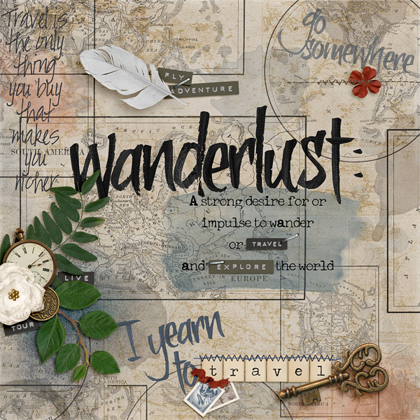
Tammy (CraftyTam) She used Traveler, Traveler AddOn, Wet Paint, CU Vintage Maps, Spilled, CU Stitch Tool Kit, CU Feathers, One Year Older, Me and My Shadow & Aviator
Donna (djp332) used the All About Me prompt of I wish as she thought of her daughter’s wedding. What a lovely thought. I really like the angle of her side border, it’s unusual and really adds to the layout. Her daughter will cherish it always.
I’d really like to see what you create with the All About Me prompt for your layouts. Share them in the gallery at scrap orchard. I check them out every week and will be on the lookout for your digital scrapbooking .

Hi there, friends! It’s Cheryl again, and I am still excited about Christmas coming! It’s my favorite time of the year, and it’s never too early to start planning for gifts to be given or received. It’s also never too soon to think about being nice if you’ve been naughty. He’s keepin’ a list, you know. Chelle’s Creations has a super cute Christmas kit called Naughty or Nice that gets me thinking about that list every time I see it, and her Creative Team has been playing with this great kit this week.
Krista used an Instagram photo to make a terrific page about her lovely tree. I love a page with a large photo, and I really love the edge treatment the photo app added to this one. The ribbons and embellishments at the corners were just the right amount of accent, and I especially love the stitches she added. She used Chelle’s CU Stitch Tool Kit for those.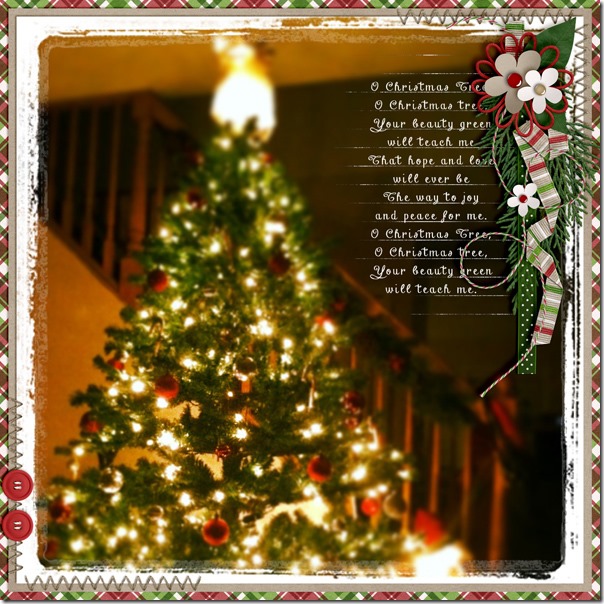
Helen made a gorgeous page with this kit, too. I love what she did with the colors in the large photo, and I really like the placement of the pictures in a diagonal across the page. The clusters of flowers and greenery from the kit are shadowed perfectly to look very three-dimensional. Did you notice the QR code on her page? That’s a great way to add video to a digital scrapbook page. 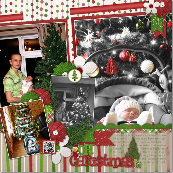
Finally, Roxana chose to make a page with some adorable pictures of her son with some favorite gifts. Looks like he might have tried to explain a mishap in that “Dear Santa” letter, and that is definitely a memory worth recording! I love the little elf she used in the flower cluster and the washi tape holding the letter down. 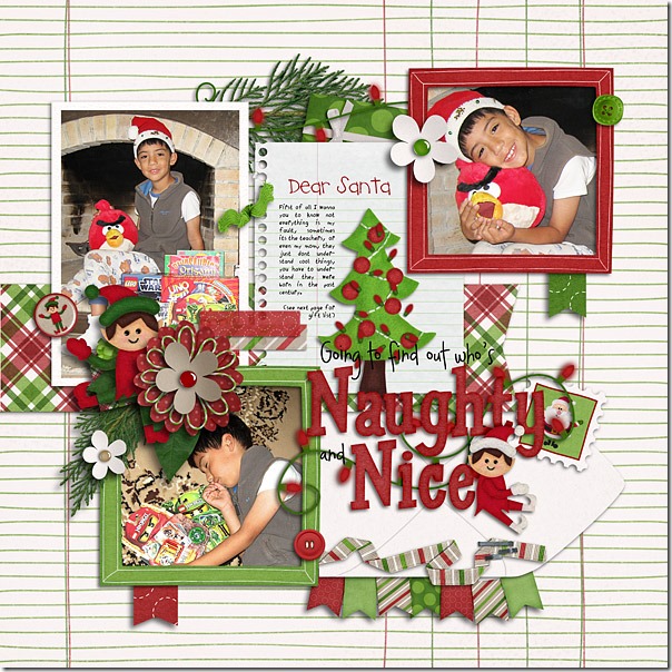
Do you have some “Dear Santa” letters to scrap? Or maybe you have a picture of a broken tree ornament with a sad note from your husband about how it really wasn’t his fault – not that I would know anything about that. But, I do have a reason to use this great scrapbook kit, and I may or may not have a similar story to tell. Here’s the kit in the market. Only 3 more months to Christmas Eve! 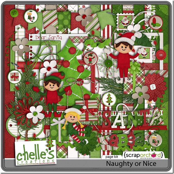
Hello Friends! I’ve been over in the gallery checking out the GREAT digital scrapbooking layouts our fellow scrappers have made. I found a few to share with you. I really enjoy seeing the layouts you create using Chelle’s awesome products.
Yolanda (ybaros) & Kirstiegirl both used See Clearly Now for their layouts. I love the big photo that Yolanda used and the definition. Kirstie’s clusters really add a nice touch; I also like the way she added the strings.
Next Shazzabess used one of Chelle’s newer products, Aviator, for her layout. Her use of stacks & stitches really add dimension to her layout.
Last ScrappinRae used Pizza Amore to share her layout of her little person getting a little slice of heaven. I think the green checkerboard near her journaling is very eye-catching.
I hope you are enjoying your scrapping opportunities this fall. Talk to you soon!

This one was fun because it included one of our “everyday” fall traditions: high school football (it happened to be homecoming) and ice cream afterwards at A&W.
Top to bottom, left to right: Getting ready while Dad reads scriptures, Marky at school: in love with the toothbrush, sobbed when it ran out of battery power (headband = hearing aides), Nat & Teanna went to the Luke Brian concert, honey nut cheerios = breakfast of champions, in a cup (no milk) = how to eat them easily on the way to school (while driving) so you aren’t late. Homecoming football game. Fireworks at halftime. Enjoying a chicken nugget on Grandma’s lap during the game. Post game tradition: ice cream @ A&W. (Em prefers to dip her fries…blech)
Two more days. We are still snapping away, but I’m not sure when I’ll get them posted…