Hey friends! I wanted to share a digital scrapbooking tutorial with you this week. Chelle gave out this tutorial back in January 22, 2015 in her newsletter. Let me show you how you won’t need scissors to make your favorite paper become fabric. Here are the links to CU Fabric Textures & CU Frayed Masks.
 +
+  =
=
Just clip a paper made with CU Fabric Styles on a CU Frayed Mask and viola! Wonderful!

So how do you make your favorite paper look like fabric? I usually use one of the methods in the recoloring class, but here’s a quick & dirty solution that will work well enough: Add the CU Fabric Texture above your paper. Change the blending mode to Overlay. For most papers this will be close enough to real. Now flatten the layers and clip it to a CU Frayed Mask!

Here are a couple of layouts from our CT members, Roxana & Krista.
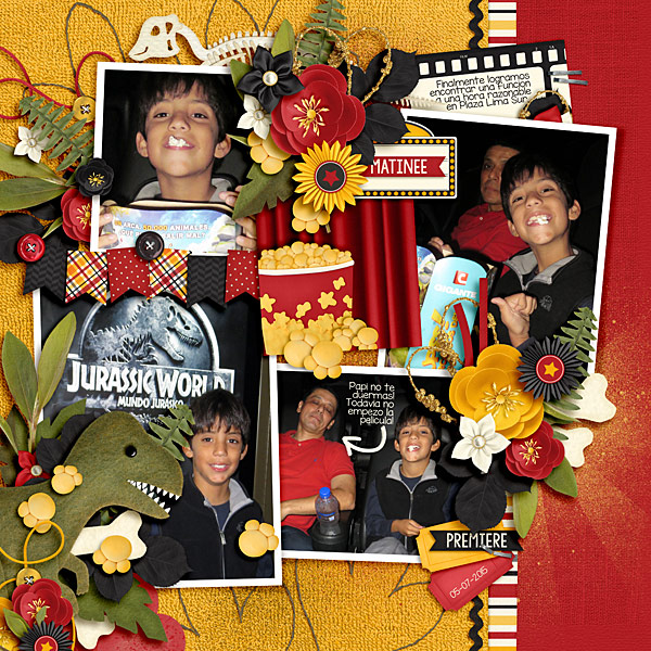
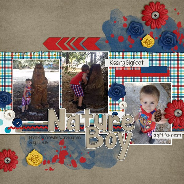
Take a chance. I bet you’ll learn some new skills.
Enjoy!
9.02.2015 It’s a SHORE THING & 3 FREEBIES! | Digital Scrapbook Freebies
Hey Scrappers!
It’s the last weekend of the summer! This week I have a great kit for all things beachy! I can’t wait to use it for the pics we took last weekend at the lake. I think I need to go scrap…as soon as I finish this newsletter. 
BUY THE KIT, GET THE WORD ART FREE! through 9.9.15
Check out these beautiful layouts by our creative team.





These fabulous double page templates look like you just tossed your photos right onto the page. White borders & curled shadows make your layouts look so dimensional you’ll want to touch them. Use them as is or each side separately.
More fun layouts to share using LIOT {Doubles} 23&24.


 \
\
As a thank you to our loyal newsletter readers, I have this FREEBIE #1. New newsletter subscribers will get the latest editing within 24 hours after you subscribe.
Then follow the sandy footprints here on the blog for FREEBIE #2
Last, catch a wave over to my Facebook Fan Page for FREEBIE #3

9.01.2015 Give me Liberty!
We’re taking a look at a classic digital scrapbooking kit in Chelle’s Creations store called Liberty, perfect for the 4th of July, or a visit to any number of patriotic sites. Let’s take a look at how her Creative Team has used this kit.
First, Jan had some photos from a visit to the Liberty Bell, so Chelle’s bundle was absolutely the best match for her memories. I love the way she used the word art for her title and the alpha for her subtitle. 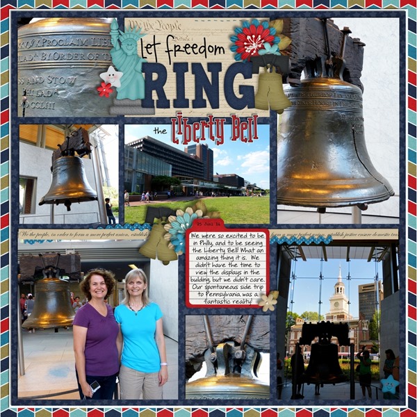
Next, Mel made a double page layout for her photos of the July 4th celebration. Her use of the banner to hold all the photos is terrific, and the weight of the pictures below the strip of paper is balanced with the title above. 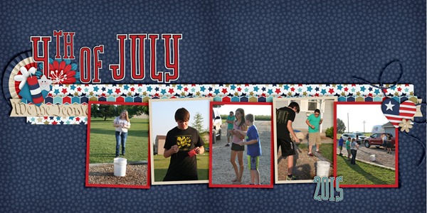
Next, Jenny had one special photo of her little guy watching the July 4th parade, and the greens in her photo are picked up by the green elements in the kit. Aren’t those little smiley-faced stars the cutest? 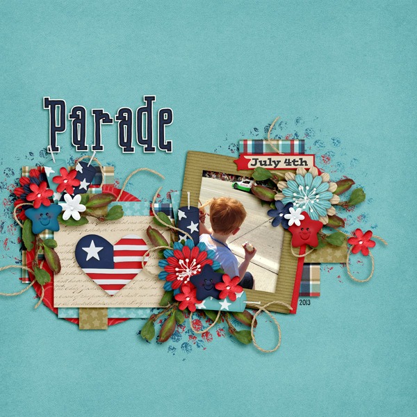
Finally, I have a page of my own to show you. Rarely do I post my pages, but this kit was such a perfect kit for a fun day of Jury Duty I had this week, that I just had to scrap the page right away and share it. By the way, I used a template from Fiddle-Dee-Dee Designs for my page as well as Chelle’s Liberty bundle. 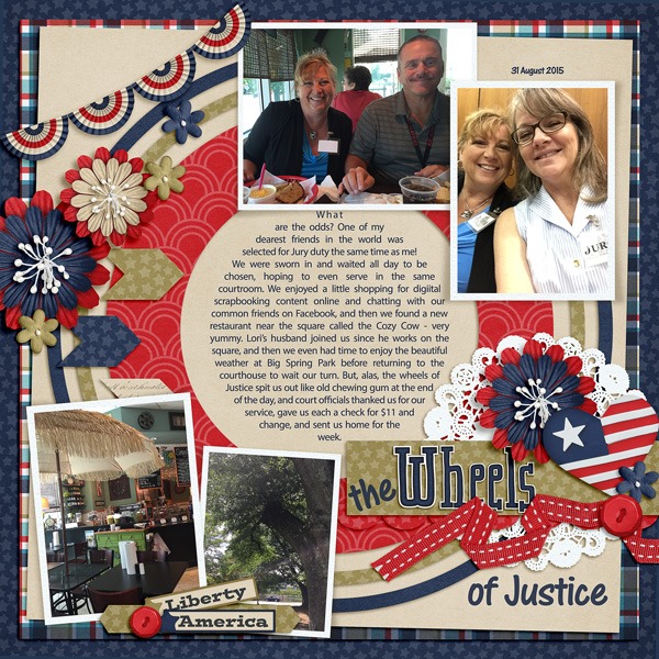
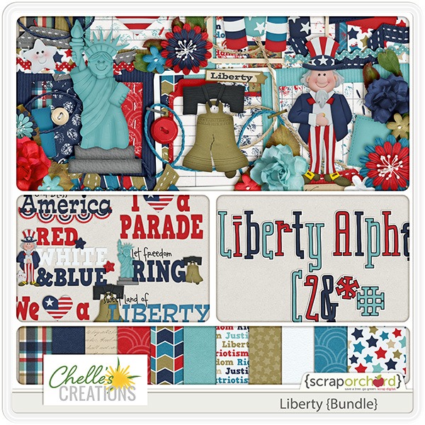
Here’s a closer look at the kit and the bundle in the market. The images are linked. 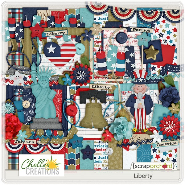
Great Outdoors Playdate | Digital Scrapbooking Week In Review
Hello Friends!
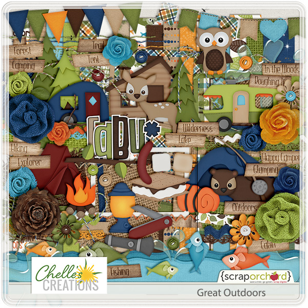
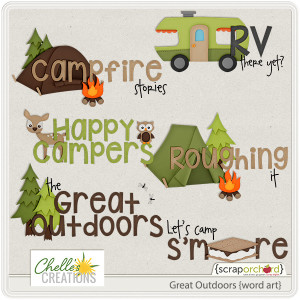
Chelle released a wonderful new digital scrapbooking great outdoorsy kit this week. Take a peek. If you buy the kit, you get the word art FREE! Of course we also have a bonus alpha. Camping, hiking, fishing, or glamping, this kit has everything you need to savor those camping memories.
If you are receiving Chelle’s Newsletter, or if you check out Chelle’s Creation’s Blog, and Facebook Fan Page, you’ll see some other goodies available that were FREE! {No links here, sorry}
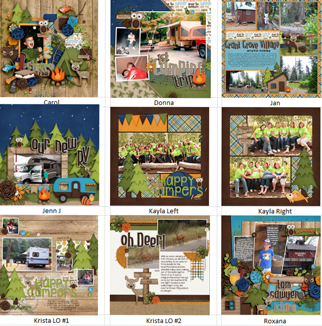
Here are some layouts from our {very} creative team.
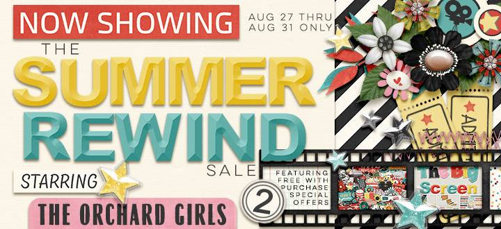
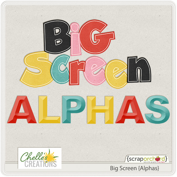
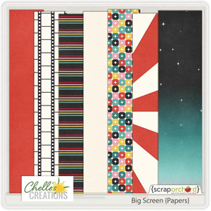
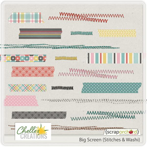
We’re in the midst of the Summer Rewind Sale at Scrap Orchard. If you missed some of Chelle’ releases, go check out the Summer Rewind Specialty Store at Scrap Orchard. Spend $15 and you get the Big Screen {Kit} & Big Screen {Add On}. I love Chelle’s Alphas. If you pick up the Big Screen Kit & Big Screen Add-On, it includes 2 new alphas, papers, stitches & washi tape. Keep an eye out. Make sure you get yours today. {No links here, you get them FREE when you spend $15.}
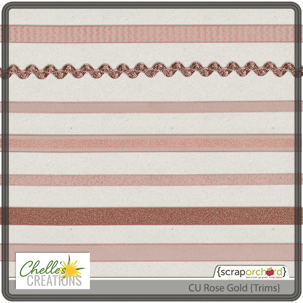
For our CU Friends, we have CU Rose Gold {Trims.} I’m predicting we’ll see more of this trend in the upcoming fall and holiday season: rose gold. A marriage of gold and Panatone’s color of the year: Marsala, it’s more pink than a traditional copper. Don’t believe me? Just google “rose gold nail polish” My florist daughter says if they spray the vase rose gold, the arrangement runs right out the door. They are getting more requests to add rose gold to bridal arrangements. I’m sure it’s also popping up in home decor. With fall on the way, here’s a handful of foiled ribbons & trims in rose gold.
Have a great weekend!
Kids Were Here! | Digital Scrapbooking Tip of the Week Classics
Hello!
Chelle wrote this tip in March of 2015. I thought it was a timely reminder as we busy Mom’s try to keep it all together. as Summer ends and we try to get everything coordinated for Back 2 School. Take a deep breath, you can keep up.

(Disclaimer! I recognize that not all of my scrapping friends fit in this category, but I think it is important for the ones that do.) (Yes, those are bits of fluorescent pink play dough mixed into the Legos. SIGH!)
“My house stays clean for 5 minutes if I’m lucky. This morning I picked up a McDonald’s Happy Meal toy and my son said “He was eating a cookie.” I guess that explains why the one arm is covered in chocolate. Crumbs. Sticky. Broken. Dirty. EVERYWHERE. Recently I stumbled on a website where photographers are embracing this phase of their lives: Kids Were Here. I really support the idea of taking a step back and relishing this season through photographing evidence that the kids were here. My youngest daughter turned 18 yesterday. My youngest son will start school this fall. I know all too well that this season is fleeting even if the mountains of laundry try to persuade me otherwise. I’m taking the challenge of documenting the Kids Were Here. I would encourage you to do the same.”
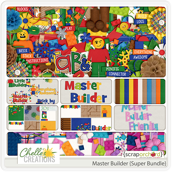
Chelle has a super bundle called Master Builder that works well with building blocks. Take a look!
Enjoy!
Great Outdoors & 3 FREEBIES | Digital Scrapbook Freebie
Hey Scrappers!
Hard to believe that summer is wrapping up, but here we are with the Summer Rewind Sale!
Summer is super busy, so if you missed any of my summer releases, here’s your chance to snag them at the new release 20% off price.
Check out those TWO Free with purchase deals!
And FINALLY making it’s debut: Great Outdoors:
BUY THE KIT, get the WORD ART FREE through 9.2

Check out these amazing layouts from our creative team.


And now…those 3 freebies:
First in the newsletter: New subscribers will get the latest version of the newsletter within 24 hours of Subscribing.
Click on image to download. Download links expire 9.2.15
Here on the blog we have the stitches:
Click on image to download. Download links expire 9.2.15
Finally in the Facebook Fan club:
Click on image to download. Download links expire 9.2.15

Shadowing 101
One of the most important features of a digital scrapbooking page must surely be the shadows. If done well, a digital scrapbooking page can be so realistic you find yourself touching the print to feel the edges of the photos layered on the page. Luckily, Chelle has a product in the market that helps with shadows. It’s called Me and My Shadow and it works with PSE, PS and programs that use .asl style files. But what if you don’t have those programs for your scrapping? Never fear: I’ll show you an example from Jan who uses Artisan 4 (same as SBC 4.0), but I’ll also show you an example from Kayla who can and does use Chelle’s shadow styles with PSE. They each have some great tips for us regarding shadowing.
First, here’s Jan’s page. She used from the In the Pocket bundle and Down on the Farm and In the Backyard. Take a look at how realistic her layers are. Here’s what she had to say about how she manipulates the shadow settings in Artisan 4 to get that look. “I usually start with the smaller shadow (Depth 0.9; Softness 0.7) for my papers and other lower-level/layer elements that I don’t want to focus on, for I want them to look like they are laying flat down on a surface, rather than ready to fly off the page. I use the higher-level shadow (Depth 2; Softness 2) for those elements I want to stand out a bit more, like photos, elements that are laying on top of photos, and the like. I will play with the settings a bit for fun, or to make things look a bit more realistic. For example, I set the shadow for the stitches at Depth 0.3; Softness 0.1, to make them look like they are actually stitched onto the page. And I wanted to draw more attention to the title and the framed photo, so I set them at Depth 2.5; Softness 2.5. The butterfly is set at Depth 3; Softness 3. I typically don’t use anything higher than that because I don’t want anything to look like its floating away on it’s own! And I didn’t shadow the text part of my title for I wanted it to look like I wrote it on the page.” 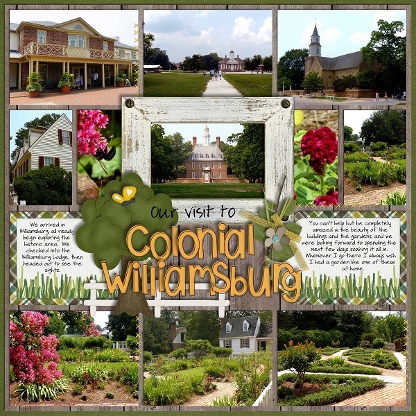
Next, Kayla used Chelle’s shadow styles along with Pajama Party Sampler 1 and Pajama Party Sampler 2. Her shadows definitely make the page look 3-dimensional, don’t they? In addition to using Chelle’s preset shadow styles, she has another great time-saving tip – copy and paste the shadow styles for similar layers. She explains, “For example I added the desired shadow style to one of the letters in my title and then right clicked on that letter in the layers panel and selected copy layer style. Then, I highlighted the rest of the letters and right clicked on the layers panel and selected paste layer style. That gave me instant shadowing for my title. I did the same for all my paper layers to quickly shadow my layout.” 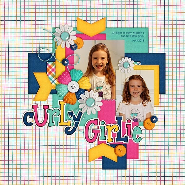
Maybe you have a time-saving tip you could share. Leave us all a comment below.
Perfect Pairs! Puppy Love & Cat’s Meow | Digital Scrapbooking Kit Combinations
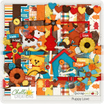
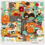
Hi! Oh my goodness! Have you seen how adorable Chelle’s July 2015 {digital scrapbooking} releases of Puppy Love & Cat’s Meow? Talk about easy kits to combine. The color’s aren’t exactly the same, but they still work well together.
First I’ll show you Lisa’s layout. I”m not usually a “brown” person but I really like Lisa use of it in this layout.
Then here’s a layout from Karen. Isn’t is great that we can all scrap all the members of our family? (Especially the animal ones)
This layout is by Krista. She has a double page layout. Her photos are fantastic!
Here are the kits & Alphas.
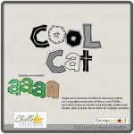
Love these alphas? They are a part of Chelle’s CU products. Here you go. CU Cool Cat Alpha Doodles. She has a tutorial on her website explaining how to use her alpha doodles. Just a thought, maybe you are looking to expand your mad digital scrapbooking skills.
Enjoy!
Gallery Stand Outs | Digital Scrapbooking Fantastic Layouts
Hello Friends!
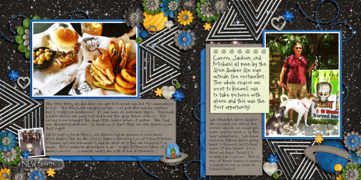
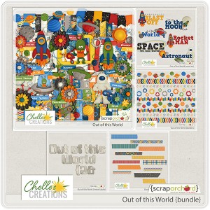
Just saw a fun digital scrapbooking layout in the pin gallery at Scrap Orchard. This fantastic layout was created by GmaMary23. She included some fantastic metal pieces in her layout. I really like the way she did her clustering on the bottom page as well. Thinking of a scraplift? She used Out of this World {Bundle}. Congrats Mary on a beautiful layout!
I started looking at other layouts and before I knew it, I had found another amazing layout to share. This one is by Cmtscrap.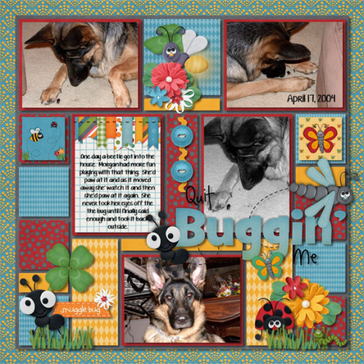
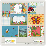
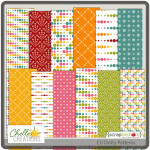
Charlene used Chelle’s Bug Town Collection & CU Dotty Patterns.
I linked all the products up for you in Chelle’s store. Enjoy!
Friday FREEBIES! Roller Coasters & Cotton Candy | Digital Scrapbooking FREEBIES
Hello Friends!
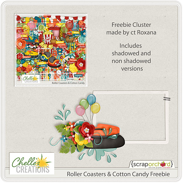
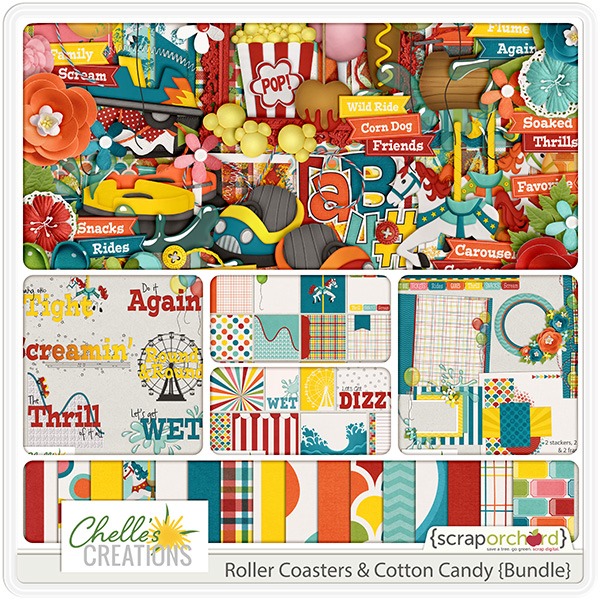
Sqee! Here’s a great digital scrapbooking freebie to use here as summer wind’s down here in the USA. Roxana made this adorable freebie for you to enjoy using the Roller Coasters & Cotton Candy Collection.
Here’s the Roller Coasters & Cotton Candy {Bundle}.








 Hi! I'm Chelle: a 40 something mom of 7. My husband & I live in a rural community in the rocky mountains with our 4 children still at home. In the winters we enjoy sledding & snuggling by the fire. I the cool fall evenings we love relaxing around the campfire & meeting friends at the county fair. Admiring the stars
