CU Shazam Playdate & Great Outdoors Sneaky Peek | Digital Scrapbooking Week In Review

Hello Friends!

Got a couple of quick things to share with you today.  First Chelle released a new fantastic Alpha Doodle this week to add to her collection, CU Shazam Alpha Doodles. I love all those fun angles and curves. Retro is hot and this alpha is the perfect fit for the retro style.   Add a hand drawn feel to your layouts.  These alpha doodles in a variety of styles will make it super easy for you to create the perfect alpha for your layout.
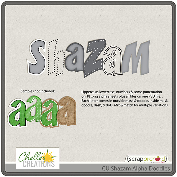
cc_CU_shazam_ad_pvw
Our Creative Team usually does layouts for our personal use products, not so much for the commercial use things, but I put the word out asking if anyone had used Shazam in a layout. Krista quickly did this layout for us.
What to use the Alpha Doodles? Here’s a link to a tutorial.
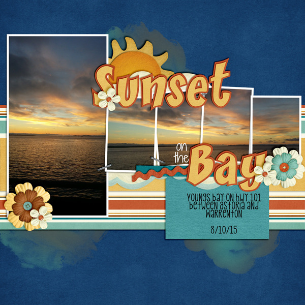
Kriista
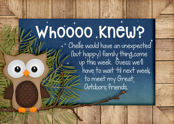
Earlier this week (in our newsletter), Chelle gave us a hint of what’s to come next week.
GreatOutdoors ad
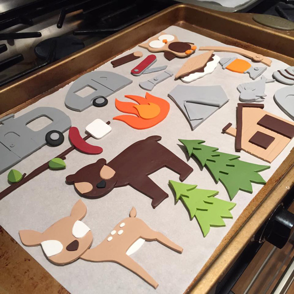
Start thinking about ways you can use Chelle’s new collection now.
great outdoors clay

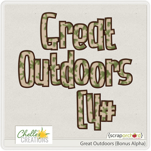
If you didn’t play twister with us, you may not have seen this alpha that coordinates with this collection.
Great Oudoors Bonus Alphabmp
Make sure you stop by Chelle’s store next week for this new collection.
Talk to you soon!
by-Sari


8.20 Video Tutorial: Resize Larger Action

Do you have older photos that you scanned or photos taken on your phone that you would love to use on layouts but they are just too small? You’ve tried just dragging to make them larger but they get distorted and grainy. Today I’m here to share with you a video on how to use to an action Chelle of Chelle’s Creations created that helps resize photos with the least amount of quality loss. Better yet Chelle is offering this action to you for FREE on her blog. Watch how to use this action below.

Now that you have seen how to use this action, head on over to the blog to pick it up. You can get it here.

Thanks so much for joining us for this tutorial. I hope it this tip allows you to use some of those older scanned photos on your layouts.

Photobombing! Get in there! | Digital Scrapbooking Words on Wednesday

Hi1 So I know that photobombing isn’t really a “Words on Wednesday” kind of thing, but I just can’t resist. Instead of being the victim, why not be the initiator and add those photos to a fun new digital scrapbooking layout. Let me show you what our ladies came up with. I think the kiddoes would absolutely love to look through a book of photobombing layouts..

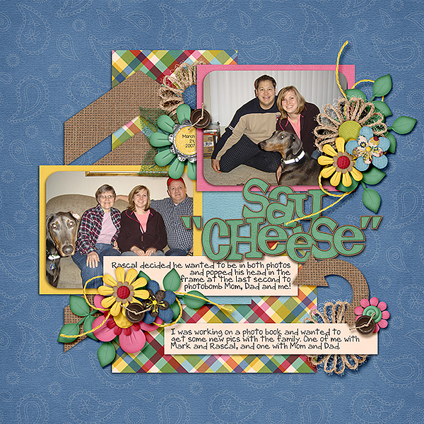
Karen (zippyoh) did double duty for us this month. She did two photobombing layouts. Look at how Rascal photo-bombed this layout with with her parents! Love it! She used Boho Summer & Boho Summer Alpha.

karen

cc_bohosummer   cc_bohosummer_ap

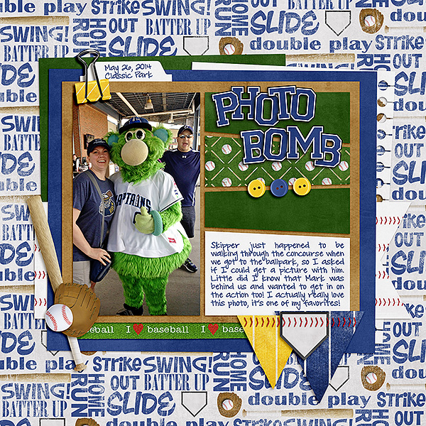
Here is Karen’s (zippyoh) 2nd layout. In this photo her hubby, Mark, got in on the action. She used Batter Up.

karen2

cc_batterup_kit.jpg

Pull out those photo’s that you thought were ruined. Create some fun layouts! You probably have more photos than you think.

by-Sari

Classics – Fleur De Violette and Creme de la Peche

Hi there digital scrapbooking fans! Have I got a treat for you! Today we’re featuring not one but two of Chelle’s Creations classic kits that are full of summery goodness and flowery happiness.

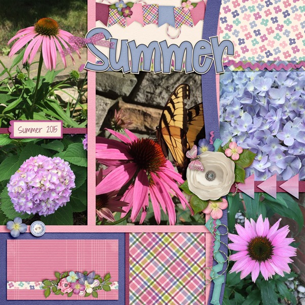
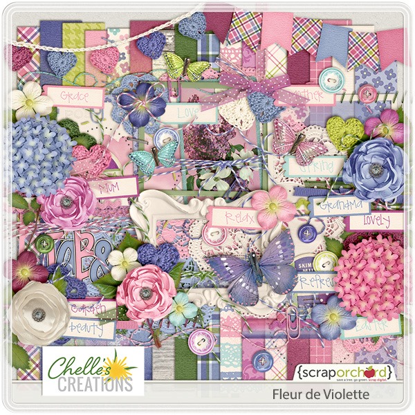
First, let’s take a look at Donna’s page that showcases the flowers in her garden. The kit and Donna’s photos are such a perfect match it looks like Chelle visited Donna just to create this kit. First, I’ll show you Donna’s page, and then you’ll see a preview of Chelle’s kit (which is linked to the market). I Love that bow Donna attached to the title. It’s the perfect touch!

web_djp332_cc_SwL_BlocksandPaperStripsTemplate2_zpsnccvcuyl

fleurdeviolettete

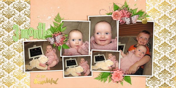
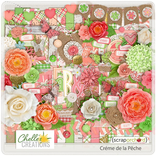
Next, is Jenny’s page who has used Creme de la Peche to match her baby’s photos. The soft peach color and flower clusters are adorable with her beautiful photos. That word art she used for the title is also available in the market in a set of golden titles here. Aubrey3monthscc_layitonthere_template_doubles_20_web cc_cremedelapeche

by_Cheryl

Lay It On There (Doubles) 23 | Digital Scrapbooking Resources

Hello Friends!
Did you pick up Chelle’s 23rd template in her Lay It On There {Doubles} #23? It was available as a digital scrapbooking freebie in July as part of the Tuesday Template series in the Scrap Orchard forum. (Hint! 24 is in the SO Forum now.)  I wanted to show you some ideas for layouts. #23 will be available in Chelle’s store a little later this year if you missed it.

Here are a couple of layouts to share with you.
Jenns
Jenn S used Aviator and Lay It On There {Doubles} Template 23.
cc_aviator
Helen
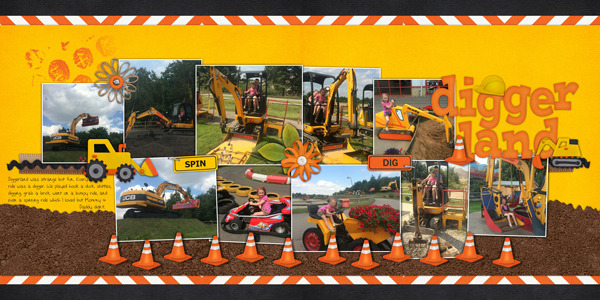
Helen used Lay It On There {Template} 23 & Hard Hat Required & HHR {Alpha}.
cc_hardhat  cc_hardhat_ap - Copy
If you haven’t done a layout using Aviator or Hard Hat, snag one of Chelle’s Lay It On There {Doubles} Templates and go for it. Enjoy!
by-Sari

CU Dotty Patterns Playdate | DIgital Scrapbooking Week In Review

Hello.

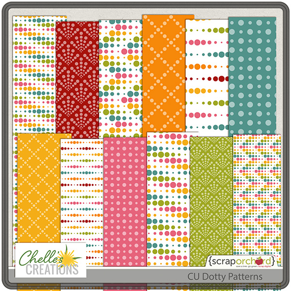
This will be a quick review. Chelle released only 1 product this week from her CU Store. Gone are the days of plain & simple polka dots.  CU Dotty Patterns makes it quick and easy to spice up your polka dot patterns.

cc_CU_dotty_patterns

For all of our friends, Chelle mentioned this in her tip of the week. Not so much a tip as a product endorsement.  A few weeks back I heard from Steph (from the Daily Digi & Capturing Magic) about a waterproof phone case.  Well, I already had a life proof case.  In fact I’ve had two of them.  I LOVE taking photos with my phone in wet situations…like the pool & water rides.  But my life proof case is pretty complicated to use and quite expensive  (less than replacing a wet phone, but still…)
ANYWAY…Steph said this phone case was affordable and worked great.  For just $10 I immediately ordered TWO.  (One for my husband and one for my daughter)  IT. IS. AWESOME.  SO easy to use.  Almost as easy as adding your phone to a ziplok back.  AND I don’t have to take my phone out of its case to use it!

Photos are as clear as if my phone was not in the case:

See you next week!

by-Sari

08.13 Video Tutorial: Resize Photo Spots in Templates

Have you been searching through your template stash and find a template you really like but it just doesn’t work with all your photos? Chelle of Chelle’s Creations has created a video tutorial to show you how to make those template work for you. Watch the video below as Chelle shares her helpful tips to get those photo spots to be just the right size.

Here are a few gorgeous examples of how Chelle’s lovely ladies used this trick to make the templates work for them.

Jan (QuiltyMom) used the the Have Yourself a Merry Little Christmas {Templates}. She made several of the photo spots bigger to fit her pictures. She also rotated a photo to accommodate a horizontal photo. The Get Your Grill On kit compliments her photos perfectly.

Some times you don’t need to make the photo spots bigger, some times you need them a little smaller. That is what Coral (Iowan) did to a few of the photo spots in her layout using the Lay it On There {Singles} 3 & 4. The One Year Older kit is perfect for this birthday layout. I really love her candle scatter as well the photo tucked underneath the present cluster.

Did you love the products Chelle used for her video? You can grab them in her store at Scrap Orchard. While you are there check out the other fabulous goodies she has to offer. She has a growing line of Lay It On There templates that are both single and double pages.

Hope this tips helps. I will see you in a few weeks with another great tip from Chelle.

Recoloring My World

Hi digital scrapbooking friends! I know you’ll agree with me that one of the greatest reasons to scrapbook digitally is because kit items that don’t quite match my pages can be recolored and match photos perfectly. Recoloring items in a kit can change the entire feeling of a page and stretch your stash infinitely. Chelle’s friends have a couple of examples to show you how they like to recolor. If you need some help with the specifics of recoloring, check out Chelle’s Creations YouTube video on recoloring her CU Mini FLowers here.

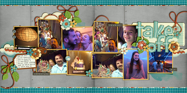
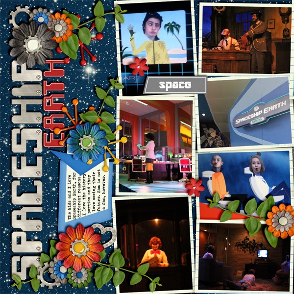
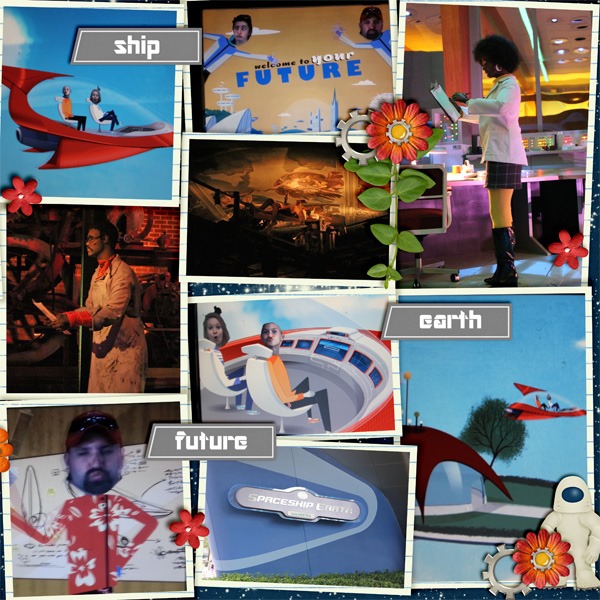
First, Jenn had some photos from a family vacation, and Chelle’s kit Out of This World was the obvious choice to match the theme. But she wanted word strips that would mimic the signs captured in her photos. The word strips in the kits were bright colors, but it was easy for her to recolor them to the gray she wanted. It was the perfect touch to make her pages unique and personal for her event. I’ll show you the double page first and then the single sides so you can see the word strips more easily. spaceship earth fullspaceship earth 1 copyspaceship earth 2 copy

Next, Helen needed some green paper and elements on her page to match her photo, so she recolored a patterned paper and a word bubble to give the desired look. She changed a red paper to green and a blue word bubble to green, all from the mini-kit I need a Hero. She points out that this is a great way to make a mini-kit feel much larger. Check it out: i-need-a-hero

Want to play? If you do some recoloring on your pages using Chelle’s Creations products, post your work in the Scrap Orchard Gallery and leave us a comment here.

by_Cheryl