SBC 4.0 offers a couple fun ways to use fonts. Inside the program, you can use any font and fill it with paper by going to the Insert ribbon and then in the text category selecting shape. I love doing this to add some papers and outlines to my fonts. But did you know that you can also make shapes from fonts? Making a font into shapes will allow you to fill your font with photos AND be able to adjust them just the way you want them. You probably already have some dingbat fonts installed on your computer and SBC4.0 had a few of them pre-installed as shapes to use. I have gone searching for a few additional dingbats that would be GREAT for using as elements or photo holders.
What to do to turn your fonts into shapes:
 1) Find the fonts you want to make into shapes. Install them to your computer.
2) If you already had SBC 4.0 running, you’ll need to restart the program for the font to be recognized.
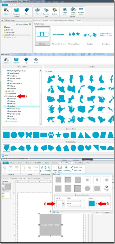
3) At the startup screen, select “Manage Content”. In the left hand column, you’ll see “Installed Fonts”.
4) Right click on that and select, “Add a font”. Scroll through your list to find the fonts you want to turn into shapes. Then select “Add” at the bottom. [At this point, if you just want to use the shape, you can simply insert it by going to the Insert Ribbon and then Shape and find the font shape you want. If you want to make it a live shape, able to move or scale a photo or paper inside it, read on.]
5) Insert an Empty Frame from the Insert Ribbon and select it.
6) Go to the Format Photos Ribbon and select “Select Mat”. Click on the Cutout button.
7) In the left hand column, select “Installed Fonts”. You should see the font you just installed. Select that
font and scroll in the font preview area for the shape you want and select it.
8) Before you exit out of the “Select Mat” pop-up window, change the “Mat fill” to transparent. This will allow your shape to have no background visible on your page.
9) Fill your shape with paper or a photo.
If you like horses, find a horse font. Birds, find a bird font. Install it, fill it with paper or a photo, and off you go. Find a frames font and fill those with paper and you’ll instantly have fun frames for any SBC+ project. Have fun playing. Here are some links to fonts you can try:
http://www.dafont.com/geobats.font
http://cleversomeday.wordpress.com/2…r-die-cutters/
http://www.fonts2u.com/dj-horses-1.font
http://bestdesignoptions.com/?p=10816
And here are some examples of pages made from our team using this technique:
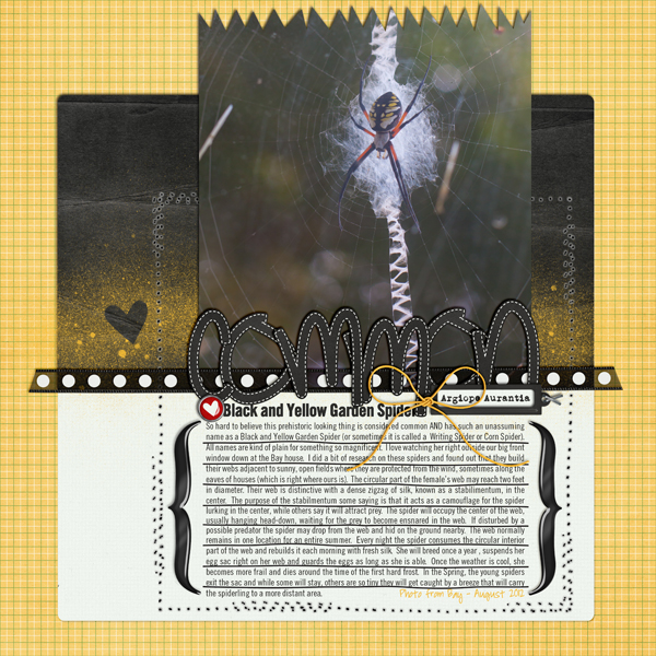
Here, I (aka lab130) used Chelle’s On The Trail and Geobats font for my Germany shape. I’ll use this as the title page for my recent trip to Germany. 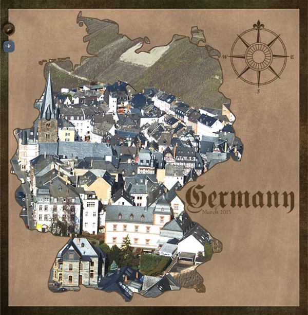
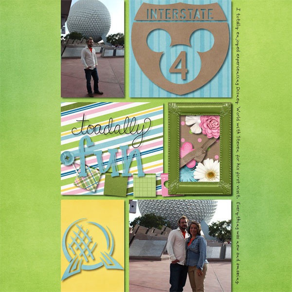
Here, Lynett (aka Lynett_Rock) uses Disney Dings to make some great shapes. I’m going to have to get this font for myself, I think! The kit she used is Toadally.
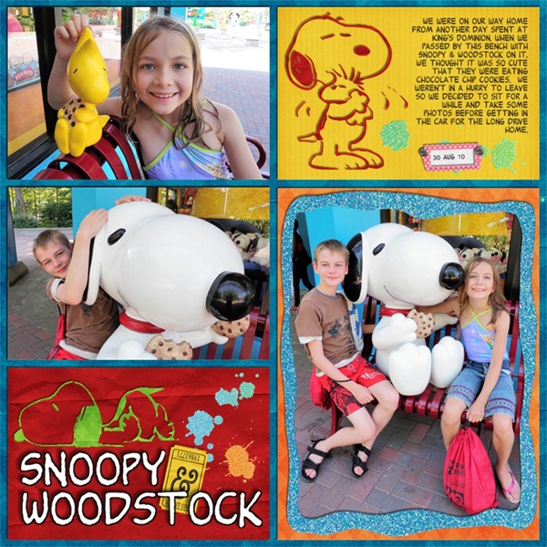
Here, Jan (aka QuiltyMom) uses her Snoopy Dings to make Snoopy shapes and fill them with paper. Aren’t they cute?? She used Ticket to Ride and In the Pocket.
Try out this technique and post your pages to Scrap Orchard with the hashtag #SBCfonts. I’d love to see what you do with this!


 I used



 Hi! I'm Chelle: a 40 something mom of 7. My husband & I live in a rural community in the rocky mountains with our 4 children still at home. In the winters we enjoy sledding & snuggling by the fire. I the cool fall evenings we love relaxing around the campfire & meeting friends at the county fair. Admiring the stars