Hello Everyone! Need to add a punch to your digital scrapbooking layout? Try using multiple fonts in your title. You can pick “matchy-matchy” or “not-matchy” at all. Let your creativity shine and make those titles pop. Let me show you what I mean.
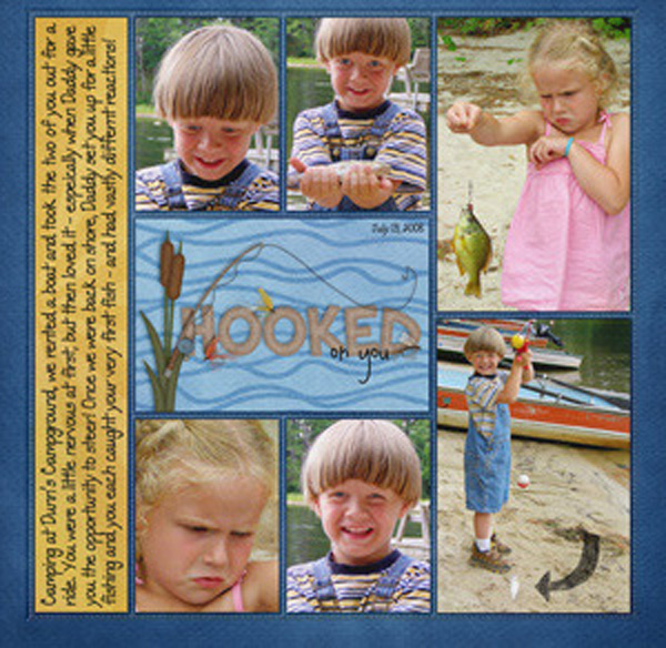
First up is Kariyn Lisa. Isn’t that picture of her daughter holding the fish so darn cute? I think she enjoyed the boating portion of their activity more than the fishing part. Kairyn used In the Pocket {Strips}, Gone Fishin & Gone Fishin Word Art & On the Water. Wouldn’t it be interesting to jump 20 years into the future and see if her daughter (now a Mom) would take her daughter fishing?
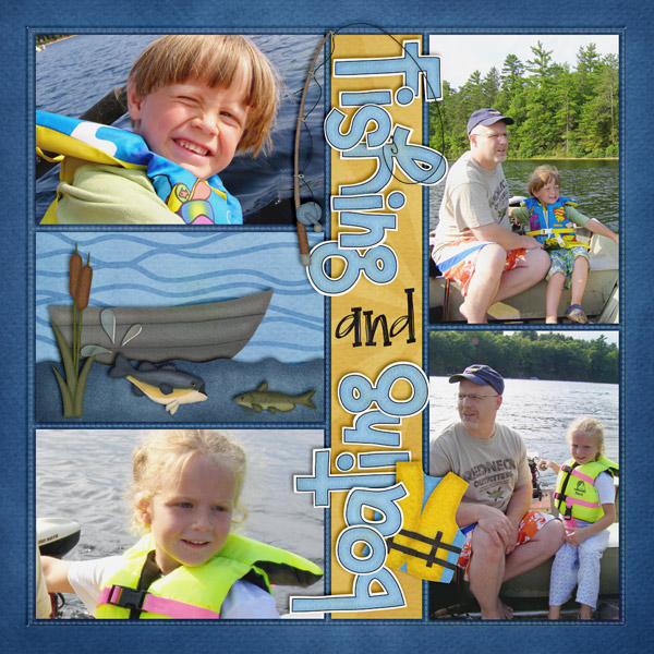
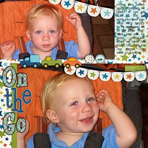
Next we have Jen G (grahamlikethecrackers) She used
About A Boy and
CU Dynamic Alpha Doodles. That little guy is going to break some hearts with that blonde hair and blue eyes. Oh, and those dimples! Love how the 3 vehicles look like they just drove off the banner. Great use of 2 large pictures and multiple fonts.
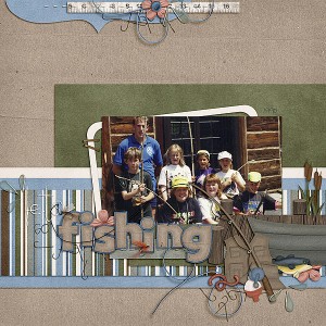
Melissa (pretty peaches) has our last layout for today. She used
Gone Fishing,
Darling Stitched-a-bet, &
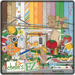
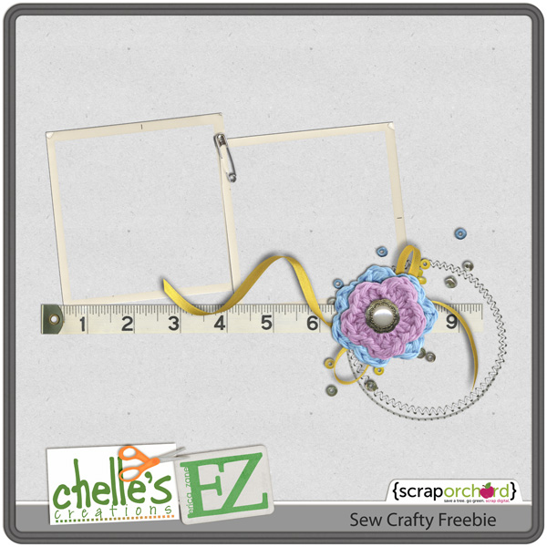
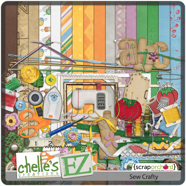
Sew Crafty. The wood shutters are a great way to “frame” the picture and the strip of lined paper really creates a stage for her clustering. She used a regular alpha and then placed the alpha stitches precisely where they needed to be. The fonts made me want to look closer at the layout. Last, I love the tape measure in the cluster at the top. Who doesn’t need to measure their award-winning fish?
Take a chance, change up your fonts. Take you layouts to a new level. Hope to see your digital scrapbooking layouts soon in the pin gallery at Scrap Orchard.
Hugs!









 Hi! I'm Chelle: a 40 something mom of 7. My husband & I live in a rural community in the rocky mountains with our 4 children still at home. In the winters we enjoy sledding & snuggling by the fire. I the cool fall evenings we love relaxing around the campfire & meeting friends at the county fair. Admiring the stars