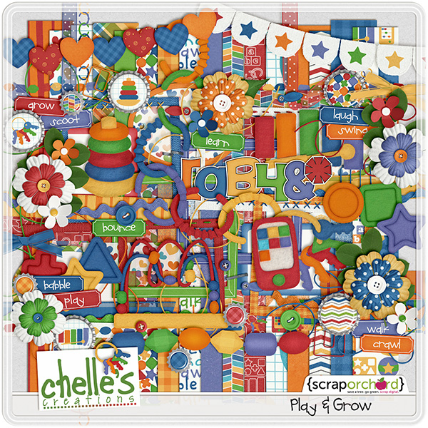
As a kid I loved to place stickers everywhere. Did you know you can get your elements to have a sticker look to them. Chelle’s Creations has this video tutorial to show you just how easy it is. Chelle uses elements from her kit Play & Grow for this video.
Here is some creative team inspiration using what they learned from the video.
Jen (supergirljennie) adds the sticker look to different elements from the See Clearly Now kit. I love how she combines a font with the See Clearly Now {alpha} to create the title on the page. She used a template by Scrapping with Liz.

This technique does not have to be used with just elements. Melissa (prettypeaches) sticker-ized the Hard Hat Required {alpha} on her layout. I love the split design of the Little Green Frog template she used. Isn’t that cluster on the bottom of the page too cute? She used the Hard Hat Required kit for this adorable page.

Love the kit Chelle used in her video? You can pick Grow & Play up in here store.

I can’t wait to see what you decided to sticker-ize!


 Hi! I'm Chelle: a 40 something mom of 7. My husband & I live in a rural community in the rocky mountains with our 4 children still at home. In the winters we enjoy sledding & snuggling by the fire. I the cool fall evenings we love relaxing around the campfire & meeting friends at the county fair. Admiring the stars