This tutorial works for alphas that are nearly black and white, like the alpha in Kick it! or the brown alpha in On the Trail. If you use the tip at the bottom this tutorial will work with the alphas in Sunnyside Up or Chillin & Grillin.
Start with one of the letters in the alpha. You can do all the letters at once if you flatten them to one layer (but not if they overlap…then just repeat this for every letter)
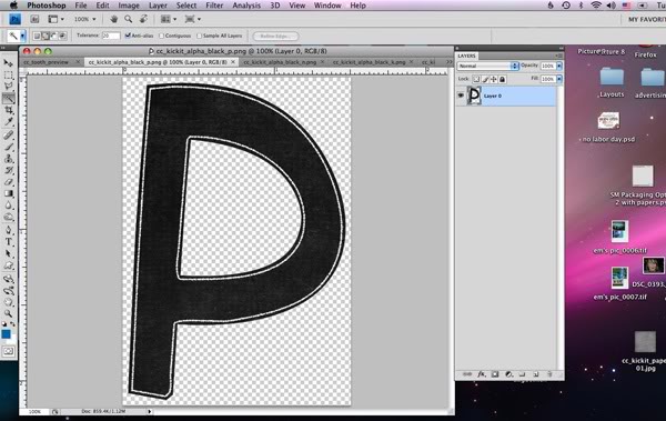
Add your favorite paper on the layer above and group the two together. (Ctrl-G or alt click when you mouse over the crack between them in your layers palette)
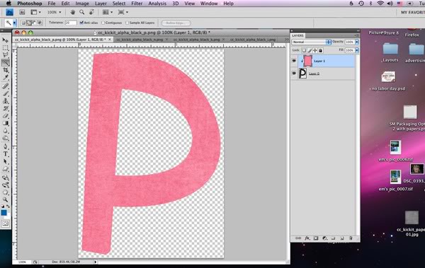
Now change the blending mode to lighten. (This won’t work for papers darker than the black of the letter, nor papers lighter than the white of the border…but stay tuned I have a tip for those borderline papers)
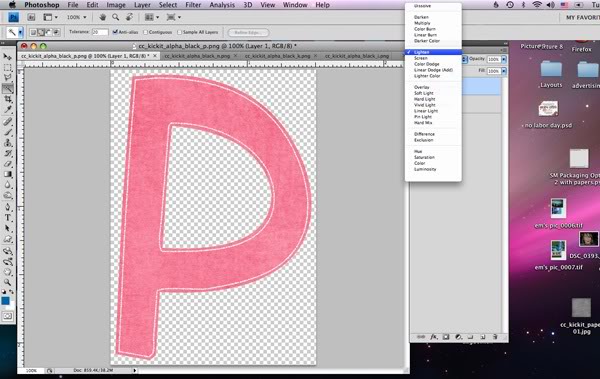
TA DA!
Here’s another twist to make it even more versatile…what if you don’t want white around the edge, what if black would suit your needs better. Go back to just the letter, but this time the first step is to invert the letter. Invert is found under Image or just use Ctrl-I. Now the alpha is white (kinda grey) with a black edge.
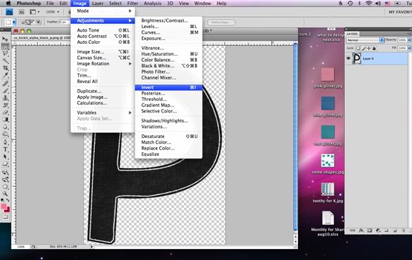
Add your favorite paper and clip, this time choosing darken as the blending mode:
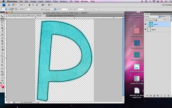
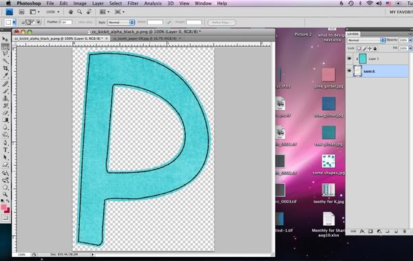
If you look closely, some of the grey of the alpha is showing through. So here’s the extra tip (it works for those borderline papers too.) Use the levels command (ctrl-L with the alpha layer chosen) to adjust the original alpha. If you are working with the black version, move the far left slider (the black one) to the right. If you are working with the white version — like we are here–then move the far right slider to the left.
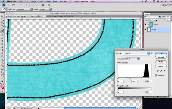
It’ll take out the light grey leaving our alpha perfectly aqua.



 Hi! I'm Chelle: a 40 something mom of 7. My husband & I live in a rural community in the rocky mountains with our 4 children still at home. In the winters we enjoy sledding & snuggling by the fire. I the cool fall evenings we love relaxing around the campfire & meeting friends at the county fair. Admiring the stars


Pingback: You Tube Channel | Digital Scrapbooking Resources - Chelle's Creations
Thanks for this informative tutorial. I have clipped papers to letters and used hue/saturation sliders, but now I can try a few more new tricks! I really haven’t used blending modes a lot; I think I just need to spend some time “playing” with them.